Green Socials — Mix & Match Package
Illustrations that make climate data cute (and wildly easy to understand).

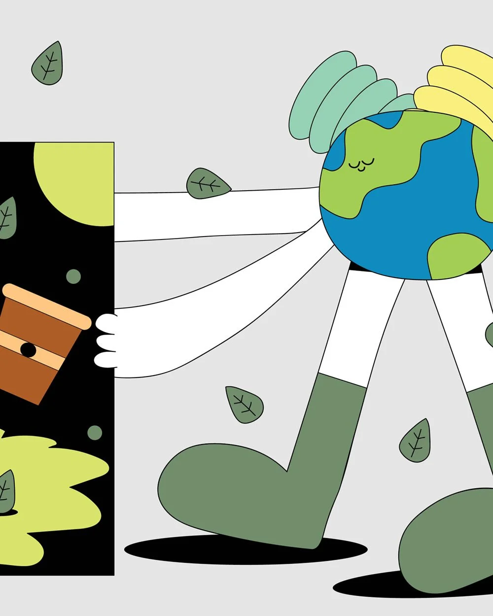
Design work for a sustainability consultant, featuring editorial-style blog graphics and an ebook cover that turns complex ideas into scroll-worthy visuals.
Identifying the problem
Not gonna lie, this one was a little out of my comfort zone. I'm usually in my bold and quirky design era—but this client needed minimal, clean visuals that didn’t distract from the message.
The brief? Create illustrations that support heavy, research-based content and communicate it clearly, without falling into the trap of green clichés or boring infographics.
Target audience
People who work in environmental policy and sustainability education.
Business leaders, CEOs, and changemakers who want to make a difference but need digestible resources.
Readers of industry blogs and downloadable ebooks who crave clarity and a little visual delight.
Qualitative Research
To make sure the work hit the mark, I immersed myself in reference content—like The Gates Notes and top-performing sustainability blogs. That helped me translate climate buzzwords into easy-to-grasp concepts using illustration.
I narrowed in on muted, earthy tones and a visual structure that matched the consultant’s values: calm, clear, intentional.
Strategy Development
I designed:
A suite of custom blog preview illustrations to pair with article titles.
An ebook cover that communicates authority, not overload.
My favourite? “Impact Unicorns are Crucial.” I mean… same. The illustration breaks down big ideas while making sustainability feel accessible, not academic. I wanted the audience to get it in a glance, but still smile while doing it.
Challenges & Solution
Minimal design isn’t usually my default setting—but that’s what made this project so fun. The challenge was dialling it down without flattening it out. Solution? Clarity through composition. Fun through thoughtful details. It’s still got me in it—just with a lot more white space.
Here’s how it turned out
Take a look at the final illustrations


go from idea soup to “holy sh*t, that’s my brand”
If this project made you feeling something… that’s the power of brand design.
Now imagine what that power could do for your brand. Whether you’ve got a fully-formed brief or just chaos in a Google Doc, I’m here to help you shape it into something scroll-stopping.